BICS postmortem

FORWARD
What a relief to have successfully managed to make a somewhat complete and self-contained game! Bull in a china shop is a 2D arkanoid (Break-out) variant, where instead of breaking as many blocks as you can, you have to avoid as many blocks as you can. The level ends in 30 seconds, so all you have to do is dodge the blocks for 30 seconds and try to maintain a high score.
Before I go into the details of the 1 month development process and what I have learned, let me share with you some of the notes/ to do lists I used to take the game.
Feature implementation for BICS
√ Give proper names for level selections (level 1 instead of March_3 build_ 1)
√ Time warp last level music so that it takes exactly 30s such that it goes seemlessly into end screen
√ Changed credits from screen space to world space, check builds if the sizing is correct
√ Add explanation that 30s reached (congrats! You have managed to contain the bull for the 30sec need for SPCA to arrive, AND you didnt lose all your money!) √ Add ticking and colour change to timer at last ten secs (low priority)
√ LEADERBOARD
√ Credits needs fixing, the 2nd and 3rd pic still don't work also
√ Level 2n tranq broke (connect ball to game object)
√ Get the levels to 10 (so add some value to total score as well, and end screen picture condition )
√ Draw a house icon for going to menu
√ Tell players to use arrow keys to move left n right
√ Get SPCA car timer working
√ Add breaking effects to trolleys (sound)
√ Reformat transition screens
√ Change intro scenes
√ Right side art for explain types of blocks
√ Add condition for diff ending picture (more than half value left)
√ Change speed of ball to Public float
√ Instantiate ball and paddle
√ Timer indication for ball spawn
√ Ball spawn lower opacity
√ Store and add total score
√ Moving brick
√ Check if all scenes the ball can work with the code in timer
√ Add "/$highest possible" to score results
√ Add alt keyboard key input for quit, restart and other buttons (zxc, space n arrow keys?)
√ Assets for moving brick and unbreakable brick
√ After confirming game bkground, change texts in transform so larger clearer fonts
√ Word names for the levels change to "money left after paying for product damanges"
√ Seperate symbol for go to menu, and change the off to ex maybe.
√ Disable certain hot keys when on level (like skipping to next scene) (bools)
√ Death sound (on death page) √ Victory sound √ Generic popup background
√ Level finish sound √ Button press sound √ Use hall of the mountain King for bkground music √ Staggering circle abv bull when spawn paused (may not need if keeping spawn text)
√ Show total score at very end
√ Reset total score for each level
√ Punishment for each block hit (text)IMPT √ slight red tint on screen the more blocks are hit?
√ Leader board (use playerPrefs to store) √ Start and end scenes animation (nah)
√ Replacing ui elements
√ Add logo to intro pg
√ Add mute (need to see if unity have universal sound bus)
√ Change all values to $
√ Permanent brick
√ Scale UI by x3
√ Ball asset, Block asset, background asset.
√ Ending picture
√ Start picture
√ Start spawn ball move down
√ Instructions
√ Lives
√ Replay
√ Ball timer (pause after respawn)
√ Add new game over for getting to 0
√ Level list
√ Credits (font and the sfx from freesounds)√ Make background window light the same as the despawn zone line (changed background)
Wow, that sure was a long list! That's because it pretty much sums up all the edits and steps I took to create the game, including minor updates and builds.
OVERVIEW OF MY PROCESS
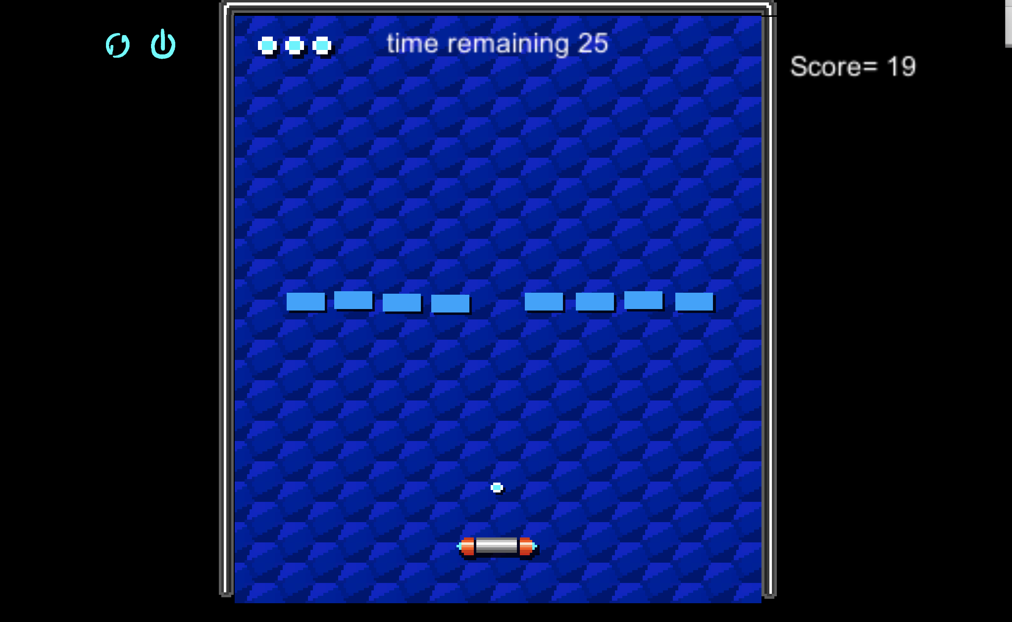
I started using an online tutorial here for the base structure of my Break-out game variant.
BICS build ver1.0
The first version of the game involved one single type of block: the blue block. It deducts a single point from the player's total score when it is hit. At this point in development, the idea of presenting the game as a "bull in the china shop" has not been confirmed yet. I was considering several different ways to go about presenting my variant.
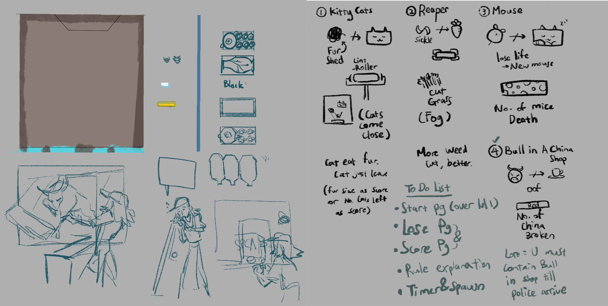
Conceptualising the game
In the end, I decided that using the "bull in a china shop" metaphor would help me bring across the core concept of my game much easier, since it is a proverb that many are familiar with. It is more likely that they will intuitively know that they are not supposed to break the china. At least, that was what I hoped. The next few builds involved drawing all the required assets for the base game of a single type block and a 30second timer. This was also when I added a "total score" for tabulation at the end of the game.
BICS build ver2.0
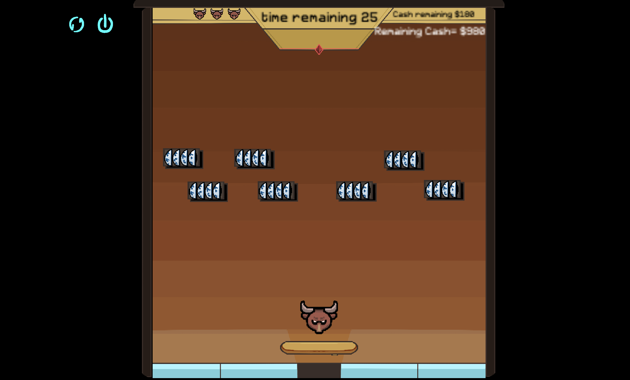
This next batch of builds are re-skinned with all my original art assets. After a round of play testing, I realised some very important things needed to change. First, all the text were way to small and blurry, since I had simply expanded the canvas set up I used for the first build of the game, using the assets from the tutorial. Those assets were 3 times smaller than the assets I drew, so expanding the canvas by 3 also expanded the text by 3 instead of increasing the font size.
Additionally, the top bar was so small that the timers and life count went unnoticed for at least one round fo the game. I took steps to fix this for the next builds.
Most play testers were also unable to figure out that the goal of the game was not to break the blocks. I think this was partially due to the fact that many of them have experience playing the original Break-out game, and thus already has certain assumptions involving this type of game. At this stage I did not have any indicators punishing players for hitting the blocks, other than the score value going down. My hope that players would understand from the title of the game that they should not hit the blocks were shattered.
Hence I needed to do a bunch of Exposition to explain the setting of the game and get people invested in NOT hitting the things.
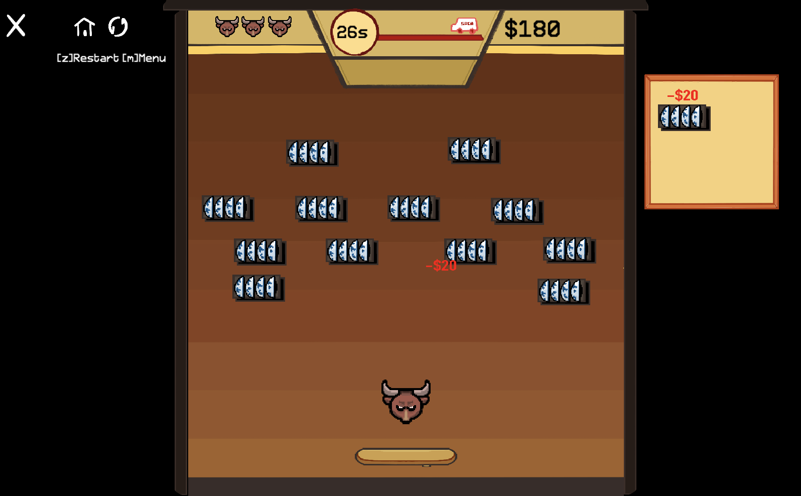
BICS build ver3.0
The next builds up to build ver 3.0 involved streamlining the design of the buttons for game UI, 2 sound effects (a cow bellow and a crashing noise) and a new font. I recycled some of the old UI elements I made for my previous, unfinished Unity game, Invisibilikkity, for the UI of this game.
I added much more telegraphing for the breakage of blocks being linked to deduction of score. The bricks would flash red, words would appear for a few moments, before the game object was destroyed. Despite this, the next round of play-testing continued to see most players smashing as much of the blocks as possible.
I also added an introduction sequence in this build, telling the story of the clerk in the china shop, whose tasked was to contain the bull in the shop. One play tester reflected that she could not understand what the pictures in the introduction meant (I had not put in words to explain the introduction sequence, hoping that they would be able to understand the story line through the graphics.). She also told me that she was not clear whether we were on the side of the bull or the clerk, hence, she had thought that she was supposed to help the bull break the blocks.
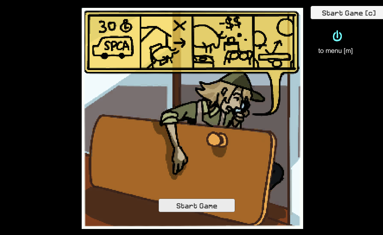
Earliest draft of Introduction scene2, BICS build ver2.4
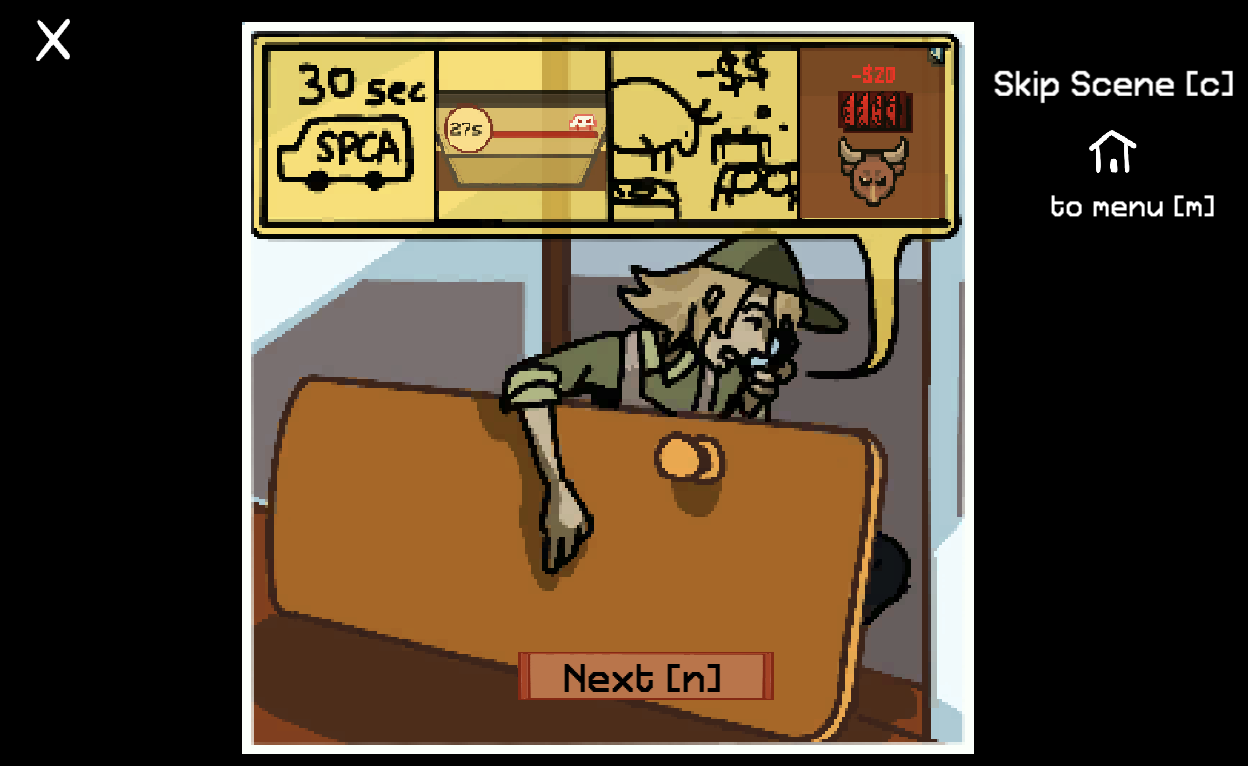
scene2 of Introduction, BICS build ver 3.0
In the end, I decided to add text to accompany scenes2 to 4 of the introduction to explain what was happening in the image.
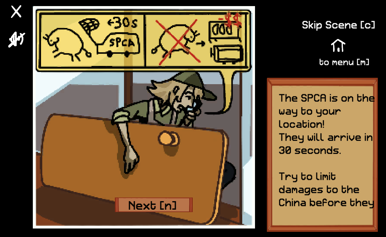
BICS build ver 4.1/ web ver 1.2
While implementing the rest of the sound effects, I also decided to add a jarring "rejection" noise that played whenever the ball collided with a block. That helped to bring about the idea that players were not supposed to hit the blocks.
I also added a new fail-state, where players that lose all their money in any stage (0/$200) will immediately get a game over and have to start from the beginning of the game. This is as harsh a game over as when the player loses all three lives by "allowing the bull to escape".
In order balance the game will some form of reward so it doesn't include only penalties, I added a new type of block, the "syringe", which allows the player to gain $100 points when it is hit by the ball. I did not explain why colliding with the syringe gives the player money in the game, but the concept was that it was some form on tranquilliser that would allow the bull to be captured by the spca more easily once they arrive.
I would have coded for the ball to slow down for a few seconds after hitting the syringe if I had more time. Instead, I was only able to implement a sprite colour change on the ball for a few seconds after syringe is hit, to broadcast that it was a good block to hit.
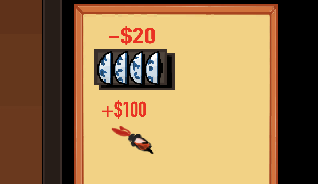
Item legend showing the normal blue block (top) and syringe (bottom)
REFLECTIONS
The biggest unsolved problem with the game is that it is just not very fun: People like smashing things, and the goal of my game is to NOT smash things. The concept was not particularly strong on it's own, but I made do the best I could.
One of the original ideas for the break-out variant was that instead of just avoiding obstacles, the player was to cover as much ground in the game as possible, somewhat like the game mechanic in splatoon. However, I was not sure how I should go about calculating the total area covered for that kind of game, and there were already quite a lot of other things I had to learn in oder to complete my first Unity game, so I did something simpler instead. I did try to make it more interesting by implementing something that IS rewarding to smash, but it was probably too little too late, and it was not a main mechanic (nor could I have let it be).
I also had rather questionable success conveying the storyline to new players of BICS. It is still rather likely for them to understand the mechanics after they had died from losing all their points for the first time, if they did not read any of the text I left in the introduction and headed straight to the first level. The good thing about adding the new fail-state is that if they had misunderstood the game, they would most definitely end up at the game-over page for hitting too many blocks. This ensures that anyone making it past the first level probably understands the rules of the game.
If I had done more play testing with the last build of the game, I might have been able to find out if my last attempts at communicating this information was effective or not. Unfortunately, the last build went live too late to carry out much play testing before the submission deadline.
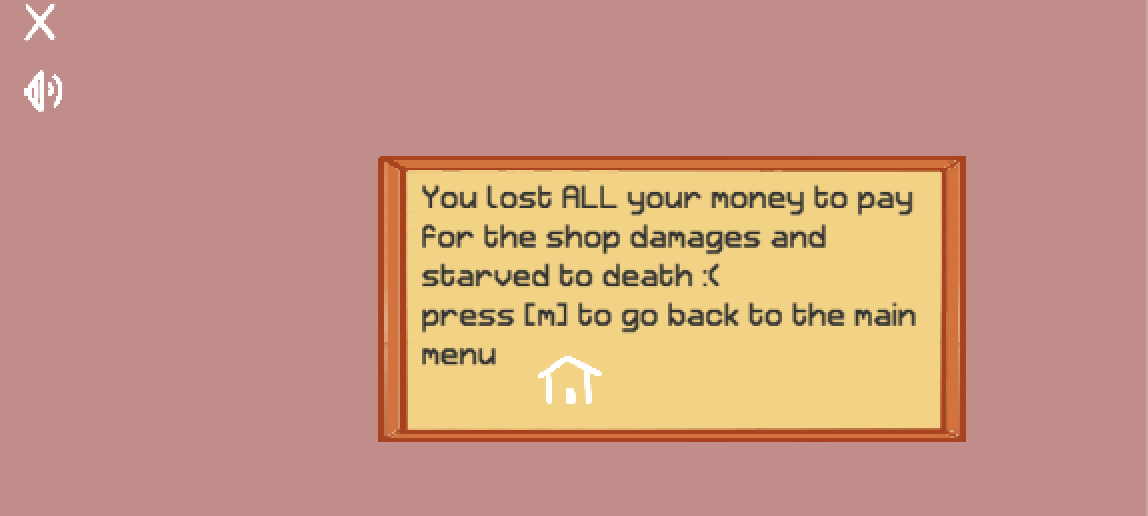
Game-over page for hitting too many blocks
After I made it clear that the player was not supposed to smash the blocks, the game do become much harder. One play tester commented that the game became much more difficult once she understood it's rules. Perhaps it is still somewhat interesting for players seeking a challenge to play my game?
Other miscellaneous regrets
What would I have done more for the game concept if I had more time? If I was given an extra week for the game, I would definitely have written my own music for the game instead of using "In the Hall of the Mountain King", however much it fits with the theme and emotion of the small game.
I would also have wanted to implement a proper High-score board with at least the top 10 players . That would additionally require me to remove the ability to refresh the score board on the game, and make sure only players who have done all the levels from start to finish can save their game data on the high score chart. This would be a fun challenge for the next game I make.
Lastly, I would have loved more time to animate the scenes in the Introduction sequence, just some simple things like having each layer of the picture slide in one after another. I had drawn the pictures in layers in hopes I would have the time to implement that, but alas, other things were of higher priority, especially since I already know how to use the animation tab in Unity and wanted to focus more on the code for this game.
Th colours chosen for the game were not great either. If I hd the chance to redo the assets for the game, I would spend more time finding an appealing colour palette for the game. I don't know why I never brought back the blue colour used in the first draft of the stage background. It was a good highlight colour for the scheme.
Next Game?
1. More play-testing: Since We've got a slightly longer period to work on the next game, I would definitely do more play-tests.
2. Colour choice and mood boarding: I was very disappointed at myself for boring colour choices in BICS, so my text game will definitely have more aesthetic colours.
3. More rewarding gameplay?: In my opinion, BICS was punishing with little incentive for players to keep playing/ replay. I want to make the next game more fun to play, in the sense that right actions will be rewarded more heavily in some way. (Indicators, pleasant sounds, just, something).
Conclusion
Either way, making the game was a good experience for me, especially since I managed my time relatively well and did not do something too overambitious for my skill level. I had enough time to implement quite a few cool UI elements, like the level select, mute and high-score saver. I was also able to implement a functional total score keeper that refreshes the level score properly when a player retries a level, something I am pretty proud of.
See you next time, when I make extra documentation regarding the code I wrote for certain features of BICS!
Get Bull in a china shop
Bull in a china shop
A bull breaks into your China Shop!
More posts
- First time doing PopupsMar 14, 2020
- Making the Blocks and BallMar 14, 2020
- Score system, saving high-scores and reactive endingMar 14, 2020
- BICS ver.1.3 OverviewMar 05, 2020
Leave a comment
Log in with itch.io to leave a comment.